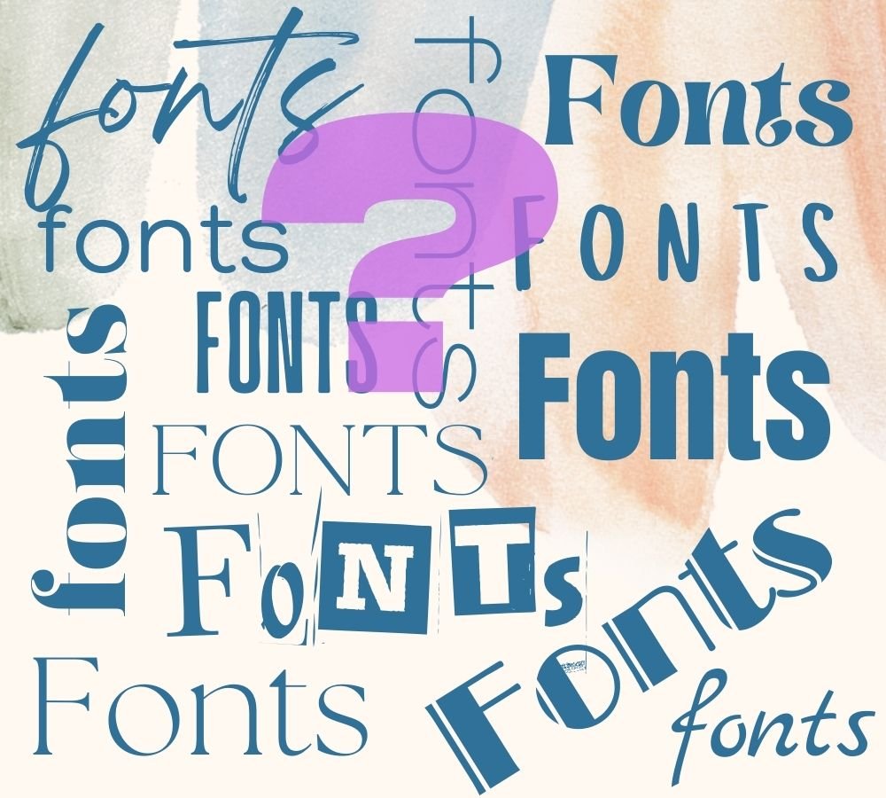
7 Perfect Squarespace Font Pairings to Elevate Your Website.
Type casted.
In today's blog, I want to share some of my favorite fonts that have bold personalities and style. They can level up your website — bringing professionalism, playfulness, and glamour, depending on what you want to convey.
There are a couple of things to consider when choosing the fonts for your website. Your fonts are the one constant element throughout your site. Some simple rules to remember are:
Easy to read
Yes, legibility. There are some cool, crazy fonts out there, but you do want your visitors to be able to read your brilliant words. Use clean, legible fonts. Keep your font size large enough for easy reading. I recommend you don't go smaller than 16px for your body copy. And depending on your audience, you may want to go larger. I love using script fonts, but they must be used strategically and sparingly, as they can be difficult to read, especially on mobile.
Reflects our brand
Your font should align with your business vibe and personality. For example, a law firm would be best to use a conservative font, one that communicates professionalism and authority. On the other hand, a designer might choose a font that expresses their unique style and showcases their creativity. A fashion blogger might go with an elegant, chic font.
In today's blog, I want to share some of my favorite fonts that have real personality and style. They can level up your website – bringing professionalism, playfulness, and glamour, depending on what you want to convey.
Quiche Sans + Ainslie Sans Condensed
I am a bit obsessed with Quiche these days — an elegant and sophisticated web font. This versatile font family, designed by Adam Ladd, is characterized by its clean lines, geometric shapes, and a touch of Art Deco influence. I am a big fan of Art Deco!
The Quiche font family offers a range of styles and variations, so you can create some beautiful effects. It consists of five primary style categories: Quiche Thin, Quiche Light, Quiche Regular, Quiche Sans, and Quiche Display. Each category includes multiple weights and corresponding italics, allowing for a wide range of typographic expression.
Another great feature is that the Quiche family is known for its high legibility, making it suitable for both headlines and body text. Depending on how you use it, Quiche works well for classic and contemporary designs.

It pairs well with Ainslie Sans Condensed, a typeface derived from the Ainslie family of fonts. Ainslie is a contemporary, versatile, and highly legible font family. It was created by Jeremy Dooley.
Ainslie Sans Condensed shares the same design characteristics as the Ainslie family but offers a more condensed variant.
The Ainslie Sans Condensed font family includes a range of weights, from Light to Black, providing a broad spectrum of options for different design needs. Each weight comes with corresponding Italic styles, so you have many design options.
In summary, Ainslie Sans Condensed has a contemporary and approachable appearance that maintains legibility even at smaller sizes.
Kelper Std Extended Display + Omnes Pro
Named after the German Renaissance astronomer, Kepler is a contemporary type family created by Adobe type designer Robert Slimbach in the tradition of classic modern 18th-century typefaces. Traditionally, modern typefaces are known for their cool intellectual quality, but Slimbach's Kepler captures the modern style in a humanistic manner. It is elegant and refined with a hint of old-style proportion and calligraphic detailing that lend warmth and energy. It has 48 styles of variations, including Condensed, Semi-condensed, and Extended, as well as display, subhead, and caption styles.

Here I paired Kelper (Headline) with Omnes Pro (body copy). Omnes Pro is a popular and versatile font family designed by Joshua Darden that I tend to use quite a bit. It is known for its contemporary and humanist design, balancing legibility and aesthetic appeal — so it checks all the boxes.
Rounded letterforms and soft curves contribute to its friendly and approachable appearance. The font family includes a wide range of weights and styles, including Regular, Italic, Bold, and Condensed variants, providing a wide range of design options.
ITC Avant Garde Gothic Pro + Adrianna
I love ITC Avant Garde Gothic Pro for its clean and minimalist appearance. It is a typeface that is part of the ITC Avant Garde Gothic font family. It is a geometric sans-serif font known for its distinctive and modern design. Herb Lubalin and Tom Carnase originally designed ITC Avant Garde Gothic in the 1970s.
ITC Avant Garde Gothic Pro has a range of weights such as Light, Book, Medium, Demi, and Bold, as well as corresponding italic styles for each weight. You can mix different weights and styles and keep a clean, modern look.

It pairs well with the Adrianna font family designed by Chank Diesel. Adrianna includes 36 styles ranging from Condensed to Extended, Light to Extra Bold, all with accompanying Italics, so lots of options here. It was designed to be a versatile, highly legible font (we like that) that blends in and almost becomes invisible, so people read your words and are not distracted by the font.
It is a fashionable yet restrained sans-serif font family for sophisticated designs and offers a competent, charming "invisible" sans ideal for websites. What is not to love?
Novel Display Condensed Black + Roc Grotesk
The Novel font, designed by Christoph Dunst, is a contemporary serif font that perfectly balances classic elegance and modern readability. The condensed black style is strong but, because of the curves, offers warmth and accessibility.
Novel combines classic serif characteristics with subtle contemporary details, giving you a sophisticated and timeless appearance that still conveys warmth. The font family includes multiple styles and weights, such as Regular, Italic, Medium, Medium Italic, Bold, and Bold Italic. This range allows for flexibility and provides options to suit different design needs.

I paired it with Roc Grotesk, one of my favorite fonts for body copy on websites. It is a modern sans-serif typeface designed by Tobias Frere-Jones; it features a clean and minimalistic aesthetic. It has a relatively low contrast between thick and thin strokes, contributing to its balanced and even appearance.
It is nice that the font family includes a range of weights and styles, from Light to Black, along with corresponding italics, making it a very flexible font with plenty of options.
Gruppo + Crimson Text
Gruppo is cool. Designed by Vernon Adams, Gruppo was conceived as a display typeface for style-conscious, laid-back branding where 'little is more.' It comes in 8 styles and six weights.
It is a perfect typeface for websites, blog templates, and logos. It is a simple, clean font that is both elegant and easygoing.

Gruppo pairs nicely with Crimson Text, a serif font designed by Sebastian Kosch. Inspired by the classical old-style typefaces, Crimson Text offers a balance between traditional elegance and modern readability. It is an aesthetically pleasing and very versatile font.
It has a harmonious and legible design that works well on websites. The font family includes various weights, such as Regular, Italic, Semibold, Semibold Italic, Bold, and Bold Italic, so there is an abundance of flexibility.
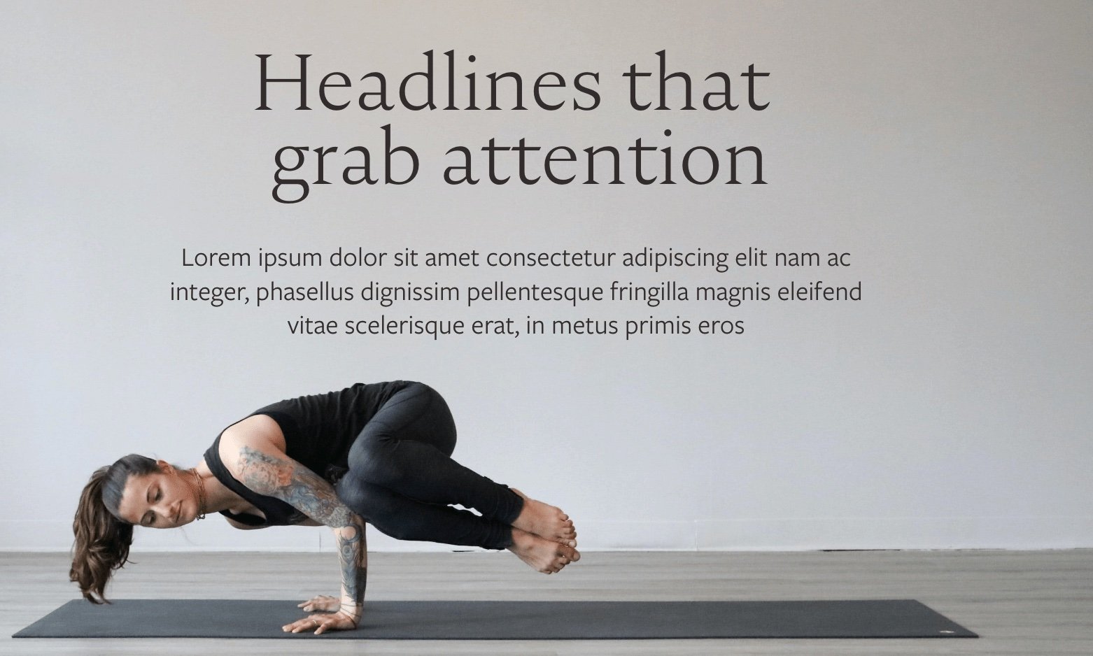
Ivy Presto Display + Neue Haas Grotest Text
The Ivy Presto font will add a touch of elegance and whimsy to your website. It makes a nice headline font for brands that require a decorative and eye-catching aesthetic. Using Italic and caps together creates a unique, sophisticated look. Ivy Presto is a display font designed by the foundry Creativemedialab.
As its name suggests, Ivy Presto is inspired by nature, particularly ivy vines, and it incorporates flowing and interwoven elements reminiscent of vines or foliage. Ivy Presto works well in headlines, titles, and logos.
One thing to note is that because of its decorative nature, Ivy Presto is not a good choice for long blocks of text or small sizes where legibility may be a priority.

I pair it here with a clean and modern font, Neue Haas Grotesk Text — a typeface that is part of the larger Neue Haas Grotesk font family.
Neue Haas Grotesk features a sans-serif design with a neutral and even appearance. The proportions and spacing are carefully crafted to ensure optimal readability and harmony in text settings, making it an excellent choice for text-heavy websites, ebooks, or blogs.
The font family offers different weights and styles, including Regular, Italic, Bold, and Bold Italic, allowing for flexibility in design.
Nocturne Serif Light + Freight Sans Pro
The lovely Nocturne Serif font has an interesting story. Created by designer Mateusz Machalski, the font was inspired by the lettering Machalski saw on the stone tablets commemorating the victims of World War II and Warsaw architecture. Its clean geometrical shapes and high contrast give it an interesting modernist feel and contribute to its being highly legible.
I like how the font surprises you with its unique characters which convey cool modernism and romantic elegance. It is a good fit for wellness brands.
Freight Sans Pro is a popular typeface designed by Joshua Darden. It is a solid “go to” sans-serif font — versatile with a contemporary and clean design. Freight Sans Pro is known for its readability and comes in and wide range of weights and styles, making it suitable for various design applications.
With its balanced and geometric design, Freight Sans Pro is a good choice when you want a modern and professional look. It comes in an impressive range of weights, from Thin to Black, including regular, italic, and condensed variations.
It is a versatile, highly legible font that is a great choice for website body text, headlines, and taglines. Plus, I think it plays well with almost all fonts.
Final words
Exploring fonts is great fun, and it can be a huge time suck as well. Squarespace offers a massive range of web fonts — serif, sans-serif, display, script, etc. Honestly, you can get lost for hours scrolling through all the options. So, my advice, before you start is to make sure you do your brand work first, so you are abundantly clear on your brand’s look, feel, and tone. Know your audience and your brand voice, values, messaging, and personality. Your website is often the most visible face of your company. Select the colors, fonts, imagery, and graphics that reinforce your brand. Happy font finding!
If you need help with your website or marketing, schedule a free discovery consultation to explore how we might work together.